Nadya Joubert

About the designer

Nadya Joubert; born 15 March. I am an energetic, loyal and quirky female passionate about design, beauty and creativity. Graphic Design is not how it looks but how it feels. Being a creative and active, energetic person, I love to problem solve and create beauty in the world. I work well under pressure and strive for only the best results. As well as Graphic Design i am a keen photographer; this helping me in my designing.

designer

Works

My Works

These showcase a few of my design works. Full portolio can be requested by e-mail nadyajoubert@gmail.com

Education

Where it all began

In high school i decided to take Design as one of my senior subjects. I chose this as i have a flair for creativity and creating new things that have a use and purpose. My teacher however, was an artist and knew little on the subject. Me being the curious individual that i am, went and researched on the subject and taught myself how to draw properly and beautifully through books and tutorials. My Graphic Design skills developed by me playing with programs and reading articles about the subject.

Graphic Design

I graduated from UniCollege West Rand with a bCom Higher National Diploma in Graohic Design. There i learnt to work the programs and shortcuts and how to design beautifully and with a function, to solve the problem at hand and work under immense pressure. I enjoyed the course thoroughly as it challenged me and taught me to think for myself and to create beautiful designs that were according to what i was briefed.

Freelance

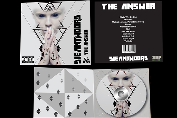
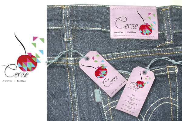
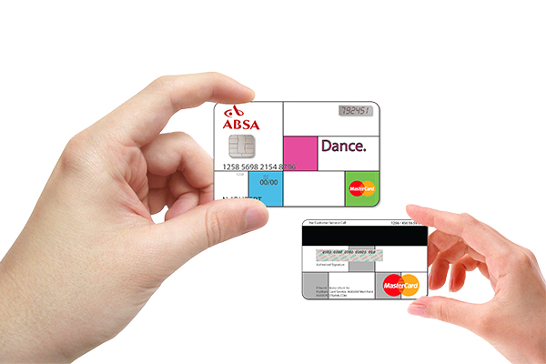
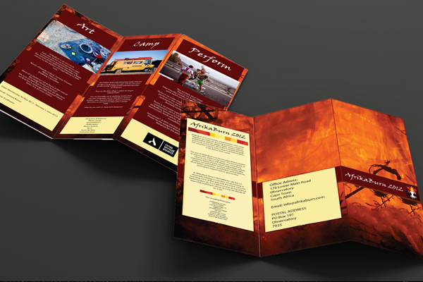
In my freelance designing I have designed digital and print media. This has gained me quite some experience in working with people and clients and how to interpret exactly what they want out of their design.

Photography

I have done a Photography short course teaching me how to manually set the program up for different types of scenes and sessions. This has taught be basic principles of photography and how to take photographs of packaging all the way to studio models. I have learned what the setups should be like and the lighting for every subject that is used. I now know what goes into the photographic side of design and i know how to set up a photoshoot and how to create perfect photographs.

Contact

Die Antwoord CD cover

Design for Die Antwoord CD Cover. The cover depicts a lady praying, the hands tattooed and the eyes fully black. The background shows triangles and light flares. This design was created because this band is quite out of the box and the design trend at that time was geometric shapes.

Jeans Tag

This was a jean tag created called Cherise, meaning cherry in French. It depicts the red cherry being broken into triangles off one side and the pieces changing colours. This follows the geometric trend with a girly contrast to it.

Credit Card design

This credit card was designed for young professionals who enjoy woring hard and spending their money. The design is of squares which depicts strictness and rigidity of rules, with splashes of colour confined in some of the squares to depict that even though they are professionals they can still have fun. The card is called Dance as the art of dancing involves a structure yet you are able to let go and have fun.

Afrika Burn Brochure

Designed to look like the fire of the burning festival, this brochure creates the sense of what the event is about, fire. The brochure contains all the details of what happens as well as the details of where the event is being held and so forth.